Book Cover Design




The Process
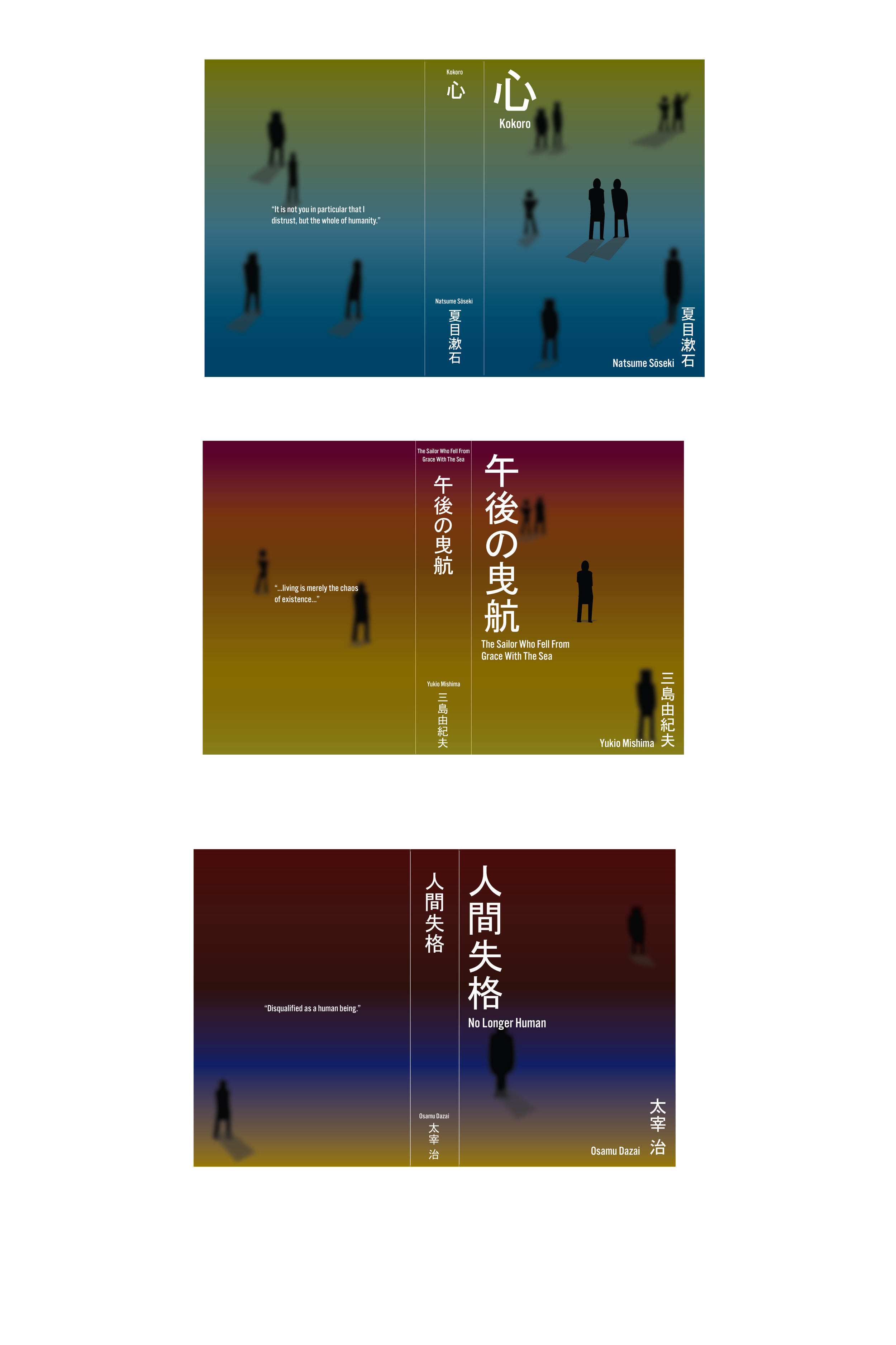
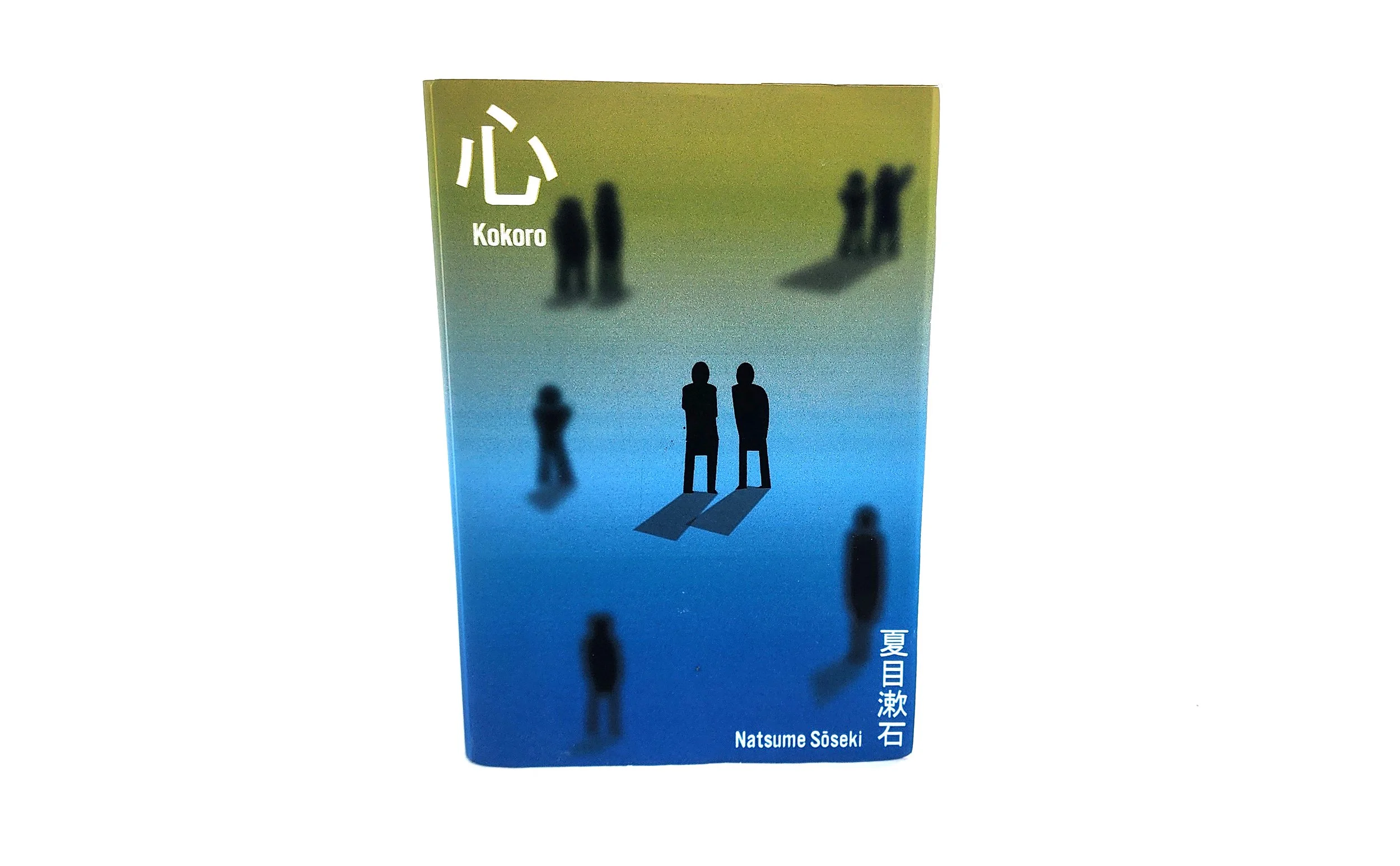
The different colors of each book cover represent day, evening, and night, symbolizing the beginning and end of life. The bystanders gradually disappear across the covers, appearing as blurred figures to reflect the main characters’ growing hatred of society.
On the front covers, two figures are clearly visible, then one, and finally none. This progression reflects each story: in Kokoro, the protagonist grows close to his Sensei; in The Sailor Who Fell from Grace with the Sea, the protagonist looks up to a mentor before eventually murdering him; and in No Longer Human, the protagonist isolates himself from society.
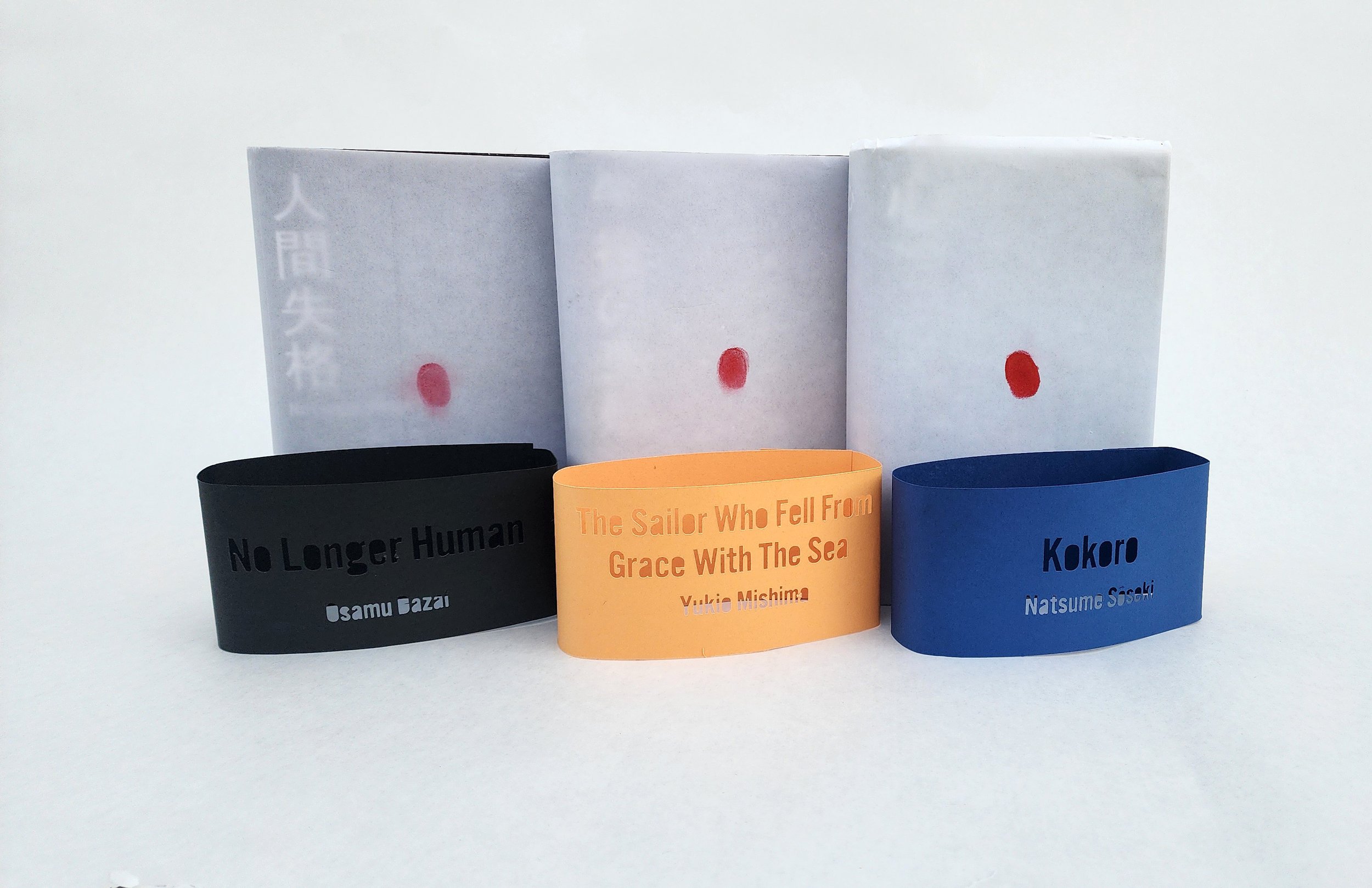
As for the back, it takes a quote from each book. Lastly for the red circle, it represents their fingerprint fading away from society.
I was inspired to design a series of book covers based on three books by different authors. Each book explores themes of social alienation and resentment toward society. I arranged the books in an order that reflects the stages of how the characters perceive society and treat themselves and others. This sequence also represents how their lives gradually spiral downward, leading to further isolation from society and, ultimately, their own downfall. The first book is Kokoro, followed by The Sailor Who Fell from Grace with the Sea, and finally, No Longer Human.